Well hello- fancy meeting you people here! A couple of you asked for a tutorial on how I made this card, and it's a good thing you are cute, because otherwise I would have told you to suck it.
I'm telling you, it's a super quick card to make. 10-15 minutes tops. The less precise you are the better. However, if this takes you all day, and you want to fret over coloring in the lines.. I say, wonderful! You do you.
Listed below are the supplies that I personally used, But, you use what you have. Make it work!
- Unity Stamp set: Rebuild Your Life (SWOON!!!)
- Versafine Onyx Black (waterproof ink is important)
- Master's Touch 140 lb Cold press watercolor paper (the smooth side). I use the 4"x6" watercolor pad. Any brand watercolor paper would do. Hot press paper would work equally well. I will say, you really want to use watercolor paper because we will be laying down some pretty wet washes to build layers
- Watercolor- I use Mission Gold. Colors are a blend of the following: Lemon Yellow, Yellow Orange, Orange, Cerulean Blue, VanDyke Green, Yellow Green
- 1" flat brush, #12 round, #4 round
- White Embossing Powder or not, gold would look lovely, or a blue too.
- Uniball Signo White
- Stampendous Fran-tage in Shabby White and Aged Gold (optional)
- A Roll of paper towel (I want to say it's Bounty, but it's pure white, with no texture to it) If you have some embossed paper towel, you can use that too, you'll get some cool textures when you lift the pigment up off the paper.
- Heat Gun
- ATG adhesive
- Mother *&^% Glossy Accents (that stuff is great but drives me crazy by the all the clogging.) Yes, I've stuck a pin in it.. no that does not work that great. Yes, I bought the fine tip nozzle, no it doesn't not work that great. But, I use it anyway and No I don't want to talk about it anymore!)
My process in 10 easy steps or less!
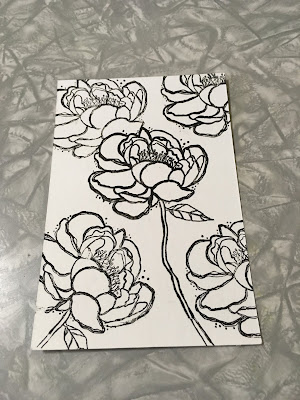
1. I first stamped my main focal image center of card. Then I used the backing sheet (that protects the cling film on the back of the stamp) to create a mask, in order to stamp the upper left image to make it appear that it's behind the focal flower. I repeat stamping until I got the card design I wanted.

2. Using my 1" flat brush, I completely cover my cardbase in clear water. You don't want it puddling everywhere kind of soaking wet, but nice and damp. While that was soaking into my paper, I mixed a loose wash of the Cerulean Blue and VanDyke green, remember, the more water, the more light and translucent the pigment will be. You decide the level of vibrancy you want.
I then added the blue/green paint in between the flowers. Because the paper is damp, and you are using a wet on wet technique the pigment will flow around and make some interesting blooms. While the paint was still wet, I added in spots of Yellow Green pigment to give the background some variation. You don't have to worry if some of the background color covers some of the petals, it's the looseness of the paint that you want. Go ahead and color any leaves while you have the blue/green mixture prepared. I then heat set my background. Sure you can tape the paper to a board, or glass cutting board. But, not really that important here. I'll show you how to fix any curling later.
3 After the background is dry, I made another loose wash of the Lemon Yellow, with just a touch of the Yellow Orange added to create a light peachy color. Then using my #12 round watercolor bush, I added clear water over each of the petals avoiding the background where possible. I followed the clear water application with the peachy color loosely over all of the petals in each of the flowers, thus creating the highlighted portions of the petals. It's ok if you leave some white areas, that adds depth.
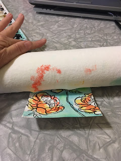
I then took my roll of paper towel and going in one direction (bottom to top) I rolled over the card base. This soaks up any puddles you may have created. Why do that you ask? I don't want my flower petals completely dry, just the excess paint picked up. We still are working in a wet on wet application here. Even though the paper isn't soaking wet, the pigments are still getting down and funky with each other. It's a great technique if you find the pigment is a bit too vibrant for your liking.

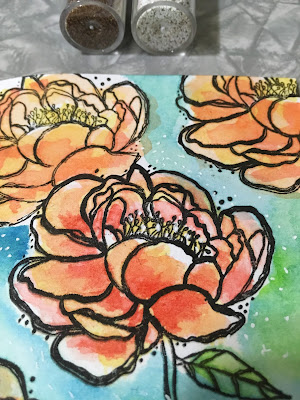
4 Now, I want my focal image to have more contrast, so I added some straight orange to the shadow parts of the flower, using my #4 round brush. I wanted more precision here, so a smaller brush works better. But, not necessary. just tread carefully with your larger brush. So, I added my shadow color pigment to the base of the petals and where petals may overlap. Nothing to detailed. Just here and there. While the pigment was co-mingling.. I also took my Uniball Signo white pen and added some dots around the flower, just for some texture. But, I'm not sure it added any measurable impact.

5. Now I broke out my heat gun. Dried the crap out of it. You can see it curled like mad. What?! You are so crazy Annie! Really, I promise it's easy to fix. Flip it over. Give it a good wet wash with water (use your big brush, or I use my spray bottle) and dry the back with your heat gun. It wants to flatten out. It NEEDS to flatten out. In stubborn areas you can add some more water and stretch the paper with your hands to encourage compliance.
And, let's be real here. I'm using cheap watercolor paper. It's not going to lay flat, even if I would have taped it to a board. Remember, this is just a card. We will glue the heck a doody out of this panel when we mat it, so any remaining warping we will tame with adhesive.
Yeah, you can see I screwed up before, I originally wanted to see how it looked on the rough side of the paper. Just not as crisp as I had wanted. So, yup, just flip that bad boy over started again!
See how flat that come out?! Not perfectly flat, but good enough.
6. I wanted my focal image to have some pizzazzz. So, I sprinkled some of the Stampendous Fran-tage chunky embossing powder in the middle of my card.
I got a little heavy handed with the gold powder, so I remind myself that it's just a card and then I got the urge to do it again, But, "NO". I said to myself, "IT WILL NOT LAND IN THE SMITHSONIAN, SO LEAVE IT BE!! Ask my besties.. I talk to myself ALL of the time.
I gave it a good zap from underneath the paper with my heat gun and that stuff melts like budda.
If you don't have any of the Fran-tage by Stampendous. Try a gold and white sharpie, paint pen,Wink of Stella, metallic gel pen, even acrylic paint. Surely you have something in your stash that will give it some texture.
7. Stamped my sentiment on black paper, embossed in white, trimmed down, and torn the one side to reveal the core. Added faux stitched lines with my Uniball Signo white pen.
8. Assembled my card, by first matting the colored image on black cardstock, then glued some sequins here and there, but not everywhere. GAWD show some restraint! I then mounted the watercolor panel using 3M foam tape. Lastly, attached to my card base and finished by adding the sentiment.
9. Wa-la. Easy Peasy. It took you longer to read the tutorial than it will to make this card.
10. Where I went wrong was that I posted this card to the Unity Show & Tell group. Look at all the work you girls made me do afterwards. YESH.
Seriously, I want to see how you girls get along with this tutorial. Give me a shout out, so I can curse you for one upping me.


